Admin and Employee Dashboard
By
Najma Zahra Annisa
on
Oct 25, 2024
Overview
This work aimed to enhance user experience of both admin and employee dashboard previously created by @hemambuja on Figma Community
Category
UI/UX Design
Tools
Figma
Here I explain the things came to my mind when I looked at the previous design. I'll detail it all into points below.
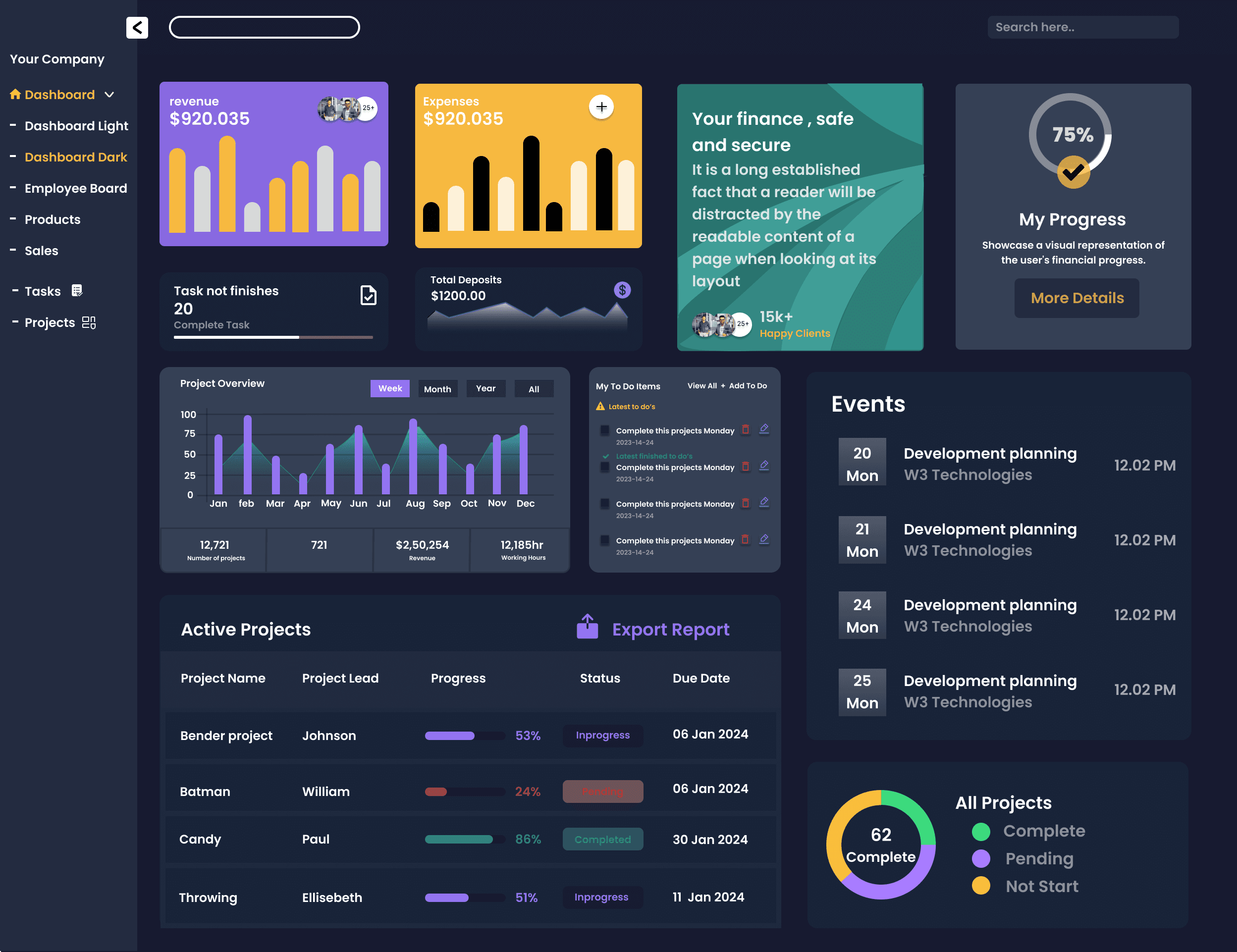
On Admin Dashboard, I realized several things:
There only one menu, 'Dashboard', while the others are submenus of 'Dashboard'.
Kind of similar menu. Users will be confused about their differences.
Unnecessary photos. Are those customer photos, or what?
No X/Y variables indicated, just showing the chart and total amount (in Revenue, Expense, and Deposit section)
Too many CTA and too detail to put on Dashboard page. Actions would be better to be accessible through its own menu page
To raise users’ focus, and being daily reminder for them, the events shown on Dashboard should only what will be held on the day, while others can be seen through its own page
Too many project details, looks too much to be shown on Dashboard
Too many section for project’s or task’s progress on the page. Highly needed simplification.
For that, I planned some improvements for this page, such as:
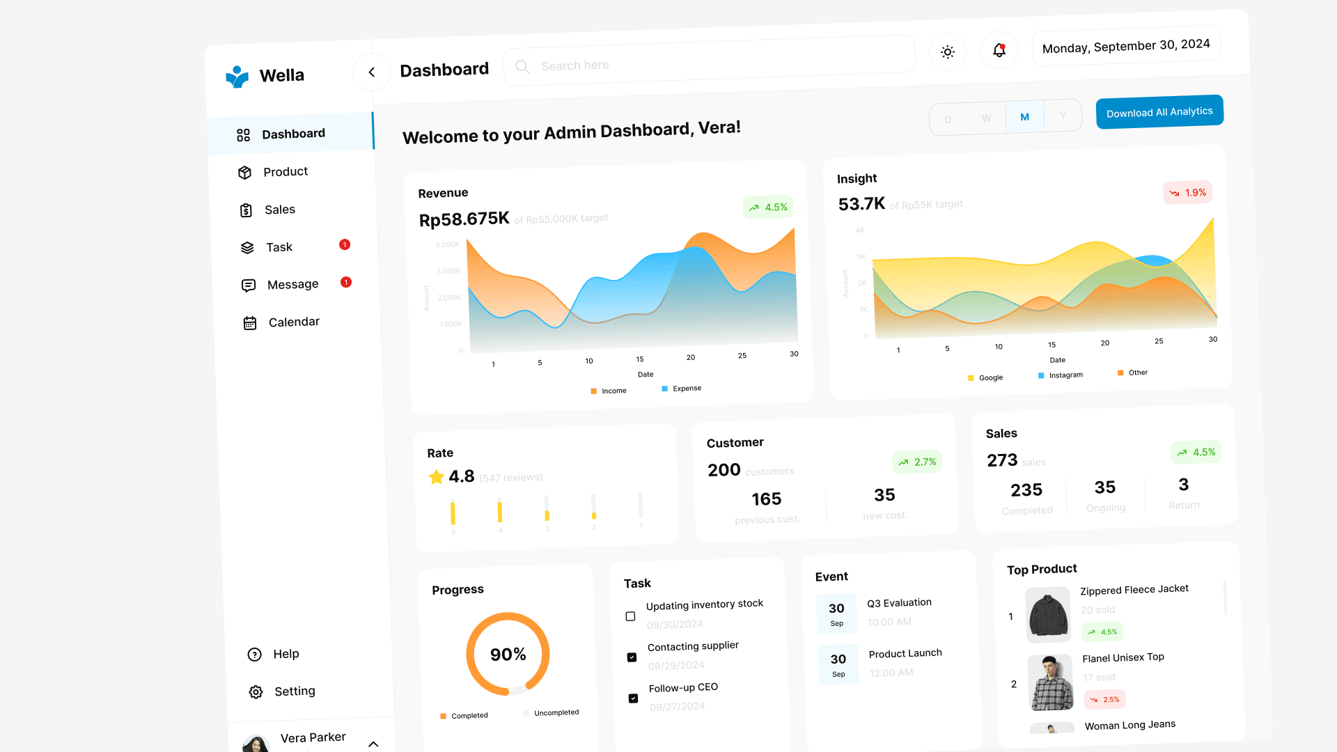
Make Dashboard as a page for monitoring performances
Balancing analytic or overview of all menu
Reduce CTA Button on the page
Add other needed features
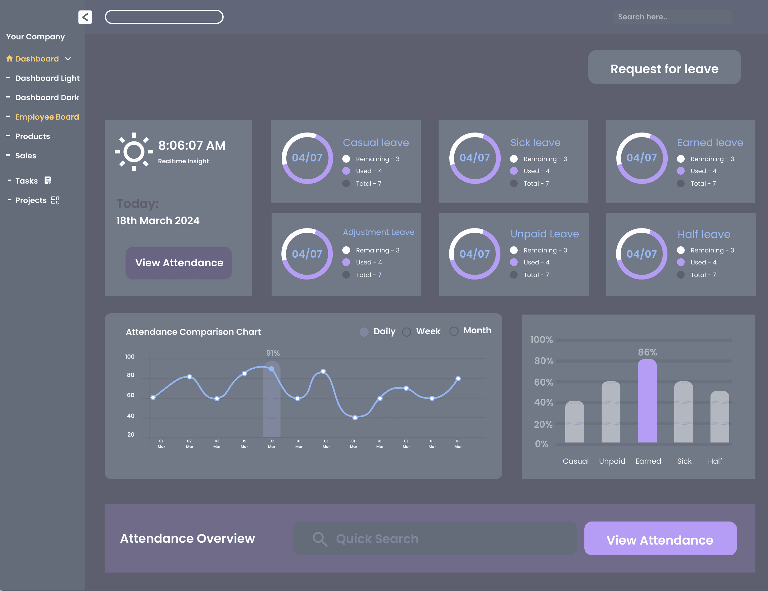
While on Employee Page, I found these things:
There two CTA buttons of ‘View Attendance’. What’s the difference between the two?
Too many bentos displaying leave days taken. Should be improved in better way
Again, another bento section with the same function as above. Although has simpler appearance, these two still need to be improved.
Considering that attendance is essential thing in professional world, the action and details regarding attendance submission can be separately placed in the 'Attendance' page.
And the improvement plans for the page above are:
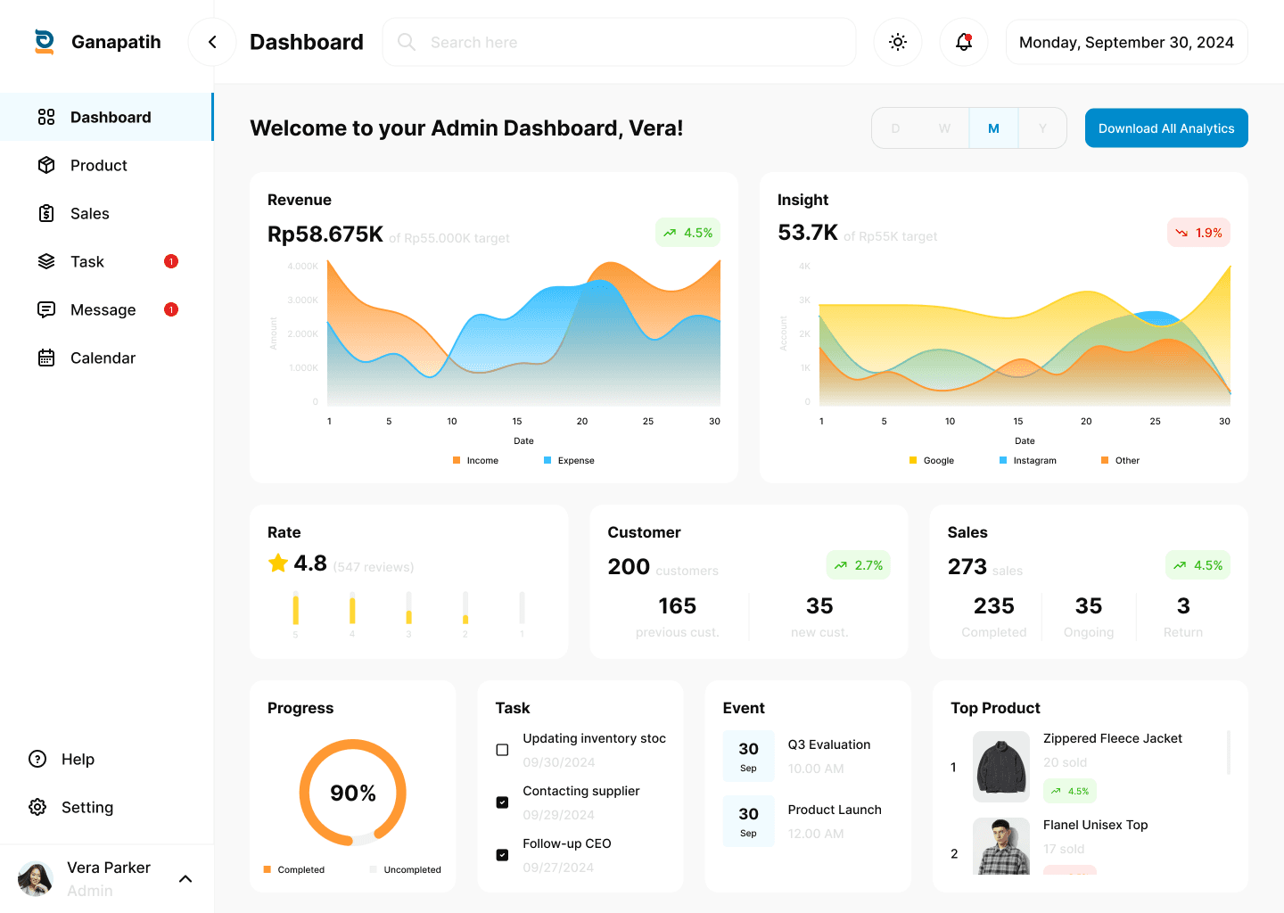
Add another features or menu to ease employee’s attendance/ status, also to motivate the employees to be more productive in work
Simplifying the interface
Want to see how my work's like? Let's see the following new design!
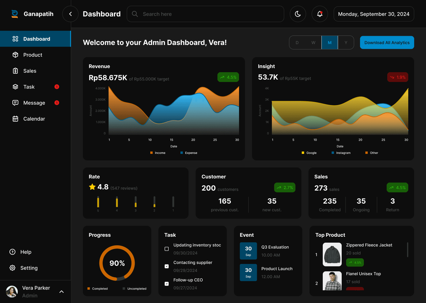
Yeah, this what I've done for Admin Dashboard. I desired to make it more simple and minimalist but still has informative details needed by users. Also I made it in two theme, light and dark, which may be changed and adjusted to users' taste effortlessly.
So how about Employee Dashboard? Let's take a look at it!
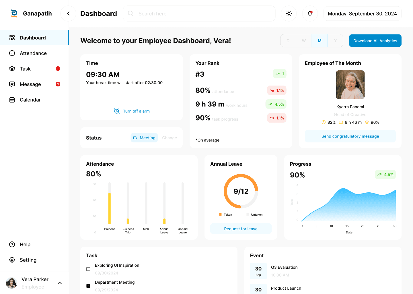
There are quite a lot of improvement I made for this Employee Dashboard, which aims to raise employee's focus while they work. Time feature is for alerting them when break or work time begins. Status feature is to inform other employees that an employee was in busy on meeting or etc. As for Rank and Employee of The Month feature is to increase employees' motivation to always give their best work. Cause most people tend to highly motivated after knowing their rank or position among others.
To see full content and explanation of this project, kindly visit it on my Behance/Dribbble